
6 Portland art shows showcase vibrant work | Column

Recently I’ve reviewed shows in Ellsworth, North Haven, Rockland, Rockport, South Portland, Thomaston and Vinalhaven. It’s been a blast crisscrossing the state, but, as Dorothy discovered in “The Wizard of Oz,” there’s no place like home. And just in time too, as there are some very vibrant things happening here (the extraordinary Homer exhibition at the PMA is up next). Today I look at six exhibitions spread across two galleries — some would say three, since two (Greenhut and Cove Street) are affiliated and in the same space. All are worth seeing.

Related
Plenty of art exhibits worth the ferry ride across Midcoast Maine | Column
RYAN ADAMS
Sometimes, an exhibition is so personal and makes us feel so much like voyeurs that our impulse can be to turn away. “From the Frozen Earth” at Notch8 gallery is such a show. Ryan Adams, a beloved Maine painter, has never truly bared his soul as an artist, at least not to this affective degree. Even his signature style — a faceting of graffiti-inspired fonts that abstracts the messages he’s painting — has always played its cards close to its chest. On one level it’s been a kind of cunning obfuscation.
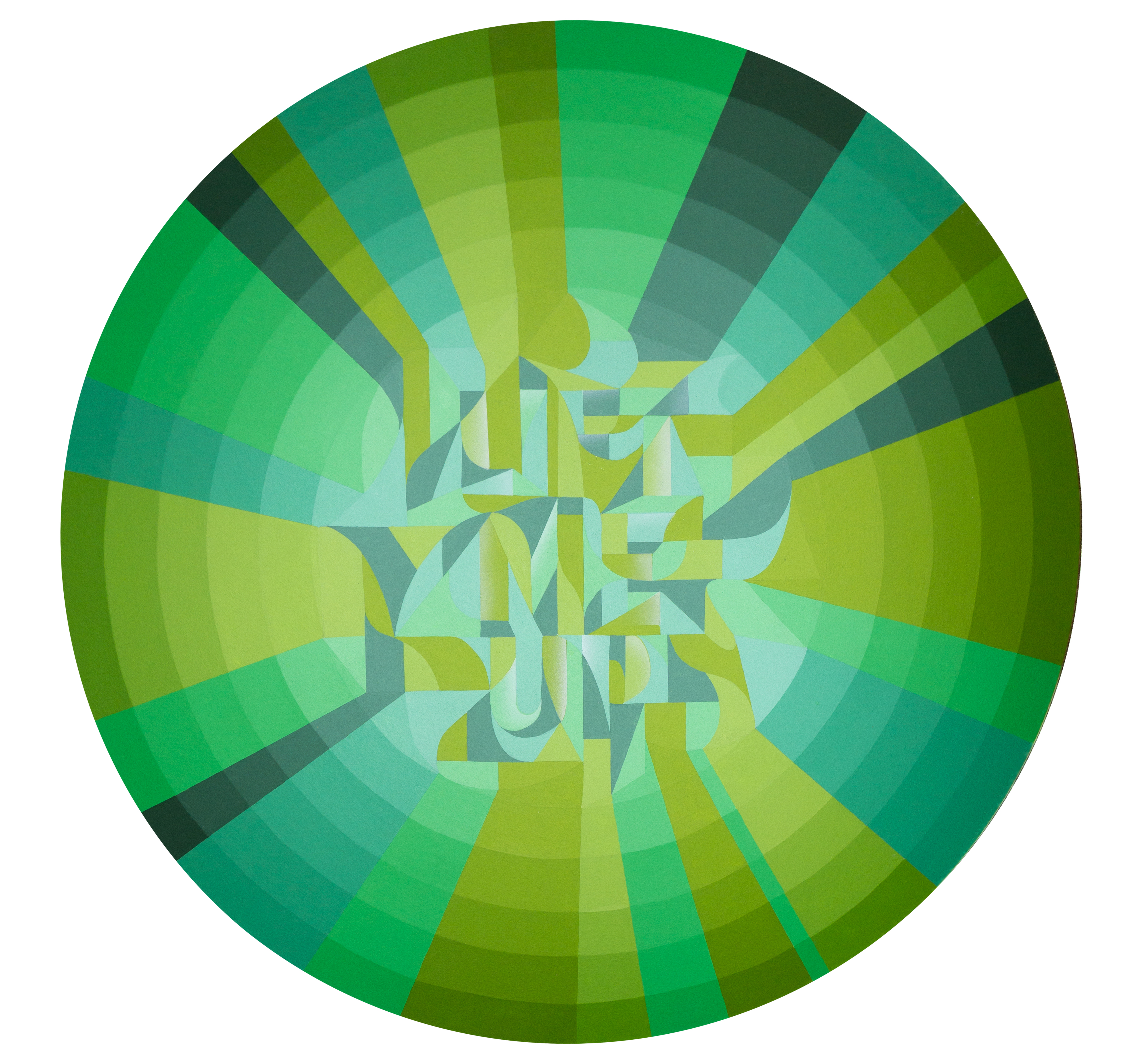
Ryan Adams, “On The Shoulders.” (Image courtesy of the artist)
For years, he and his wife, fellow artist Rachel Gloria Adams, have chosen to portray Black joy rather than focus on issues of race that undoubtedly affected them. Political and cultural content occasionally seeped in (as with a mural Ryan did for the Center for Maine Contemporary Art that, once deciphered through the fragmentation of letters, read “Use Your White Voice”).
In Notch8’s exhibition, however, Adams comes fully out of hiding. “Frozen Earth” goes to places within the artist’s interiority that, through the revelation of vulnerability and pain, gains enormous power. Though his primary medium is still painting, here he also taps into other media to afford him the right means for his message.

Related
Join our Maine Voices Live conversation with artist and muralist Ryan Adams
A case in point: “Rebel Flags in Acadia,” for which Adams printed photos of forests, then cut them up and collaged them in the same way he assembles the abstracted lettering in his paintings. It’s useful to note that this work’s title does not reveal the message embedded within it as his titles used to do. None of the works here offer this easy transparency — except a straightforward, black-on-black painting that simply reads “I LOVE US” that mostly refers to his family and community. Instead, they intentionally exhort viewers to work harder, look more deeply to understand not only the messages, but their often psychologically and physically challenging implications.
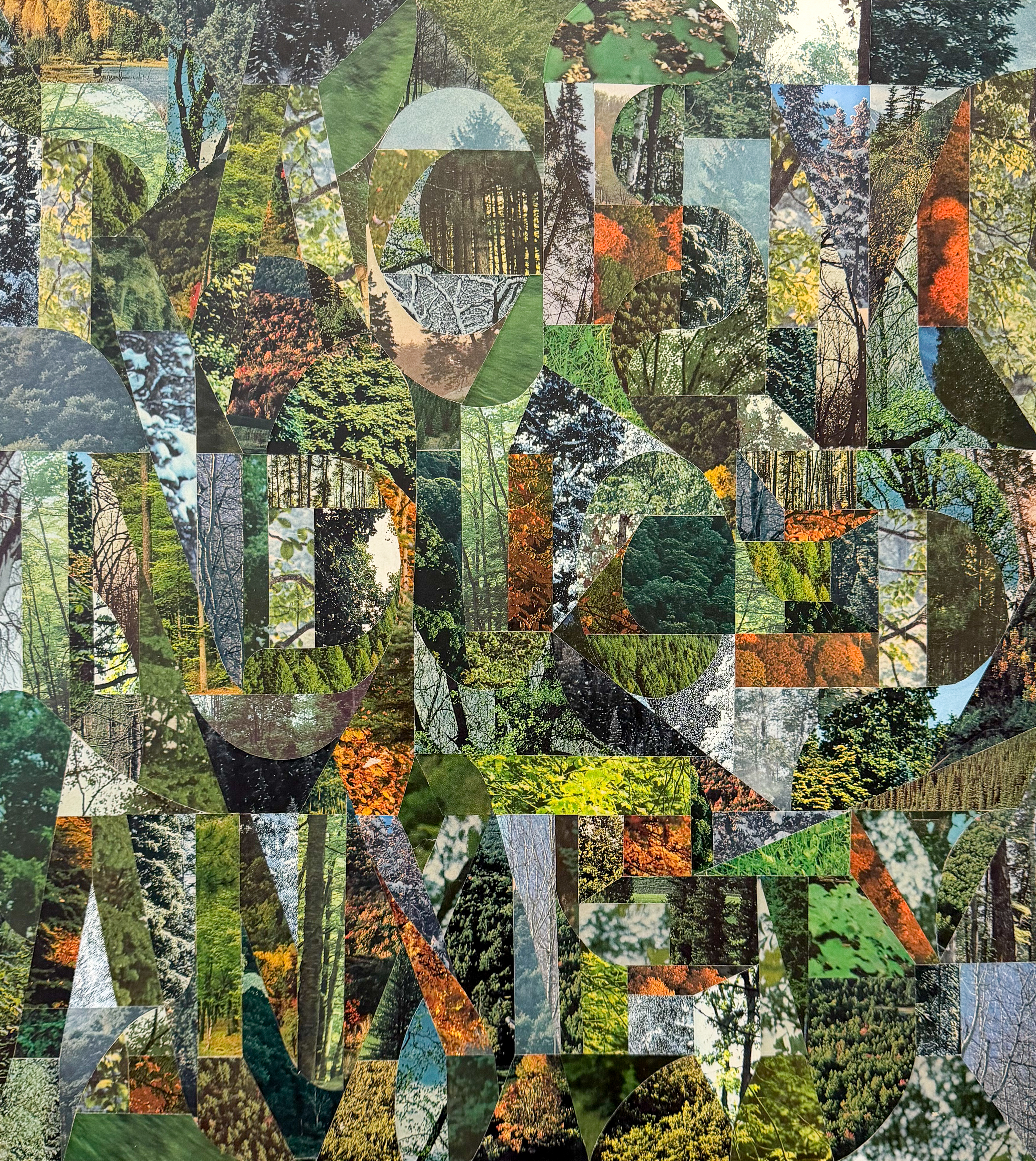
Ryan Adams, “Rebel Flags In Acadia.” (Image courtesy of the artist)
I won’t reveal the hidden message in “Rebel Flags,” first because it would dishonor Adams’s intentions and, second, because in my own naïve desire to offer readers legibility of Adams’s work in the past, I have erred in disclosing them. It’s far more interesting, and adds depth to the work, to keep us guessing. What I will say is that a small pamphlet containing Adams’s musings on the various pieces in this show will offer you a clue. Here is what he has to say about this collage:
Advertisement
“Rural Maine means something different to Black and Brown folks. The more isolated the location, the higher the chances are that you’ll run into some racist assholes. It can get dangerous, and quickly. I’ve been beaten unconscious and had guns pulled on me for being Black in rural places I shouldn’t have been. A white friend of mine recently realized that I can’t comfortably experience the same Maine that she can. I’ve learned how to navigate it over the years, so we stay safe, diligent and aware because my Black ass loves the outdoors and will very much be wherever I want to be.”

Related
For Maine artists angered by Biddeford ICE shooting, their art is their voice
It is soul-crushing to finally decode the hidden message of this particular picture. Divulging it will only weaken your experience. Heightening our encounter with all the works are family photographs (this one of Adams’s father walking on a beach in Acadia National Park). At times, the connection between a work’s phrase and the accompanying photo can break your heart, at others it can deepen our appreciation of what a radical act it can be to live a happy, loving, fulfilled life as a Black or Brown person in America. One message embedded in another painting is “THERE’S NOT A BLACK WOMAN I CAN’T THANK.” You can search for that canvas and the relevant photo on your own. Fair warning: It may bring you to tears.
I don’t want to say more about this exhibition for fear of diluting its impact on the viewer. Just go see it!
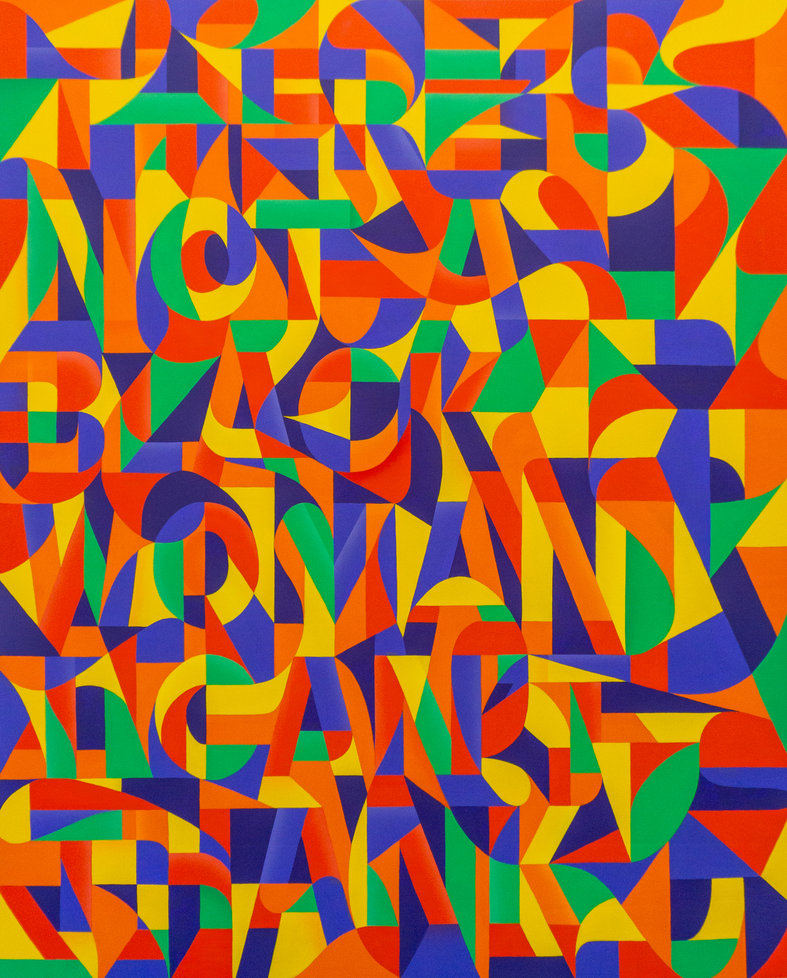
Ryan Adams, “My Cushion Was a Bosom.” (Image courtesy of the artist)
The merging of Greenhut Galleries and Cove Street Arts under one roof is complete, with the former relocated to East Bayside from the site it occupied in the Old Port for over 40 years. The Cove Street Arts spaces are devoted to three shows — all of them wonderful, and two of them — “Steve Bartlett: Passing By” and “David Row: Reflections” — working in delightful conversation with each other by contrasting Bartlett’s curved forms with Row’s angular panels. (The other is “Ellen Weitkamp: Borrowed Light.”)

Related
These Maine art galleries get creative to survive uncertain times
DAVID ROW
“Reflections” presents a textural, perpetually shifting sort of minimalism. At an abstract level, Row is playing with irregular geometries, then interrupting them in intriguing ways. Older paintings like “Lift” and “Terra Rosa” fracture the already multi-edged shape into facets or sections that are mostly orthogonal and/or triangular. But then Row will straddle the divides with curved bands of paint, creating a tension between sharp angles and curves, static and fluid forms. He has talked about these works as referencing skating tracks on ice (a pastime he has engaged in since childhood).
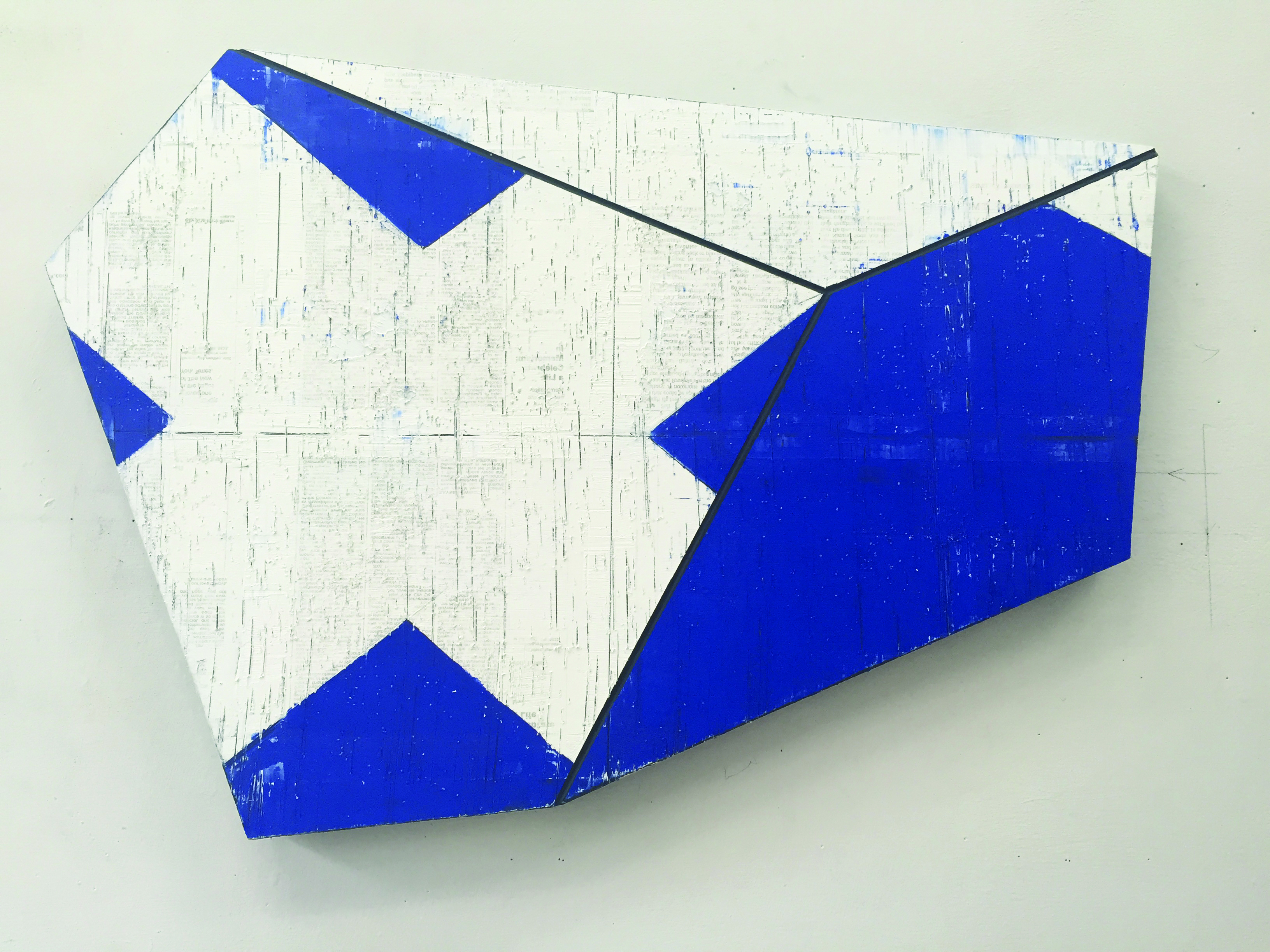
David Row, “Reflex II,” 2018, oil on panel. (Photo courtesy of the artist)
Yet these and paintings like “Reflex II” and “Warp” can also feel reminiscent of patterns or fragments of numbers on the sails of boats, suggesting nautical connotations (he is an avid boater). Even devoid of content, however, they feel more approachable than a lot of geometric minimalist art, and that is due, I believe, to the way he works the panels over, scratching or sanding them to make the surfaces highly tactile. We want to touch them.
Advertisement
Equally important is their sense of motion, which Row achieves by floating planes of colors one atop the other. He bisects “Double Horizon” with two horizontal lines that feel like fissures in the mottled gold top layer, revealing the red layer underneath. Red also seeps to the surface around the edges, giving the gold layer a sense of instability, as if it is slip-sliding over the field of color underneath, perpetually changing its form and condition. This feels infinitely more vulnerable, temporary and mysterious than, say, Barnett Newman, whose monochromatic fields of color feel locked irrevocably in place.
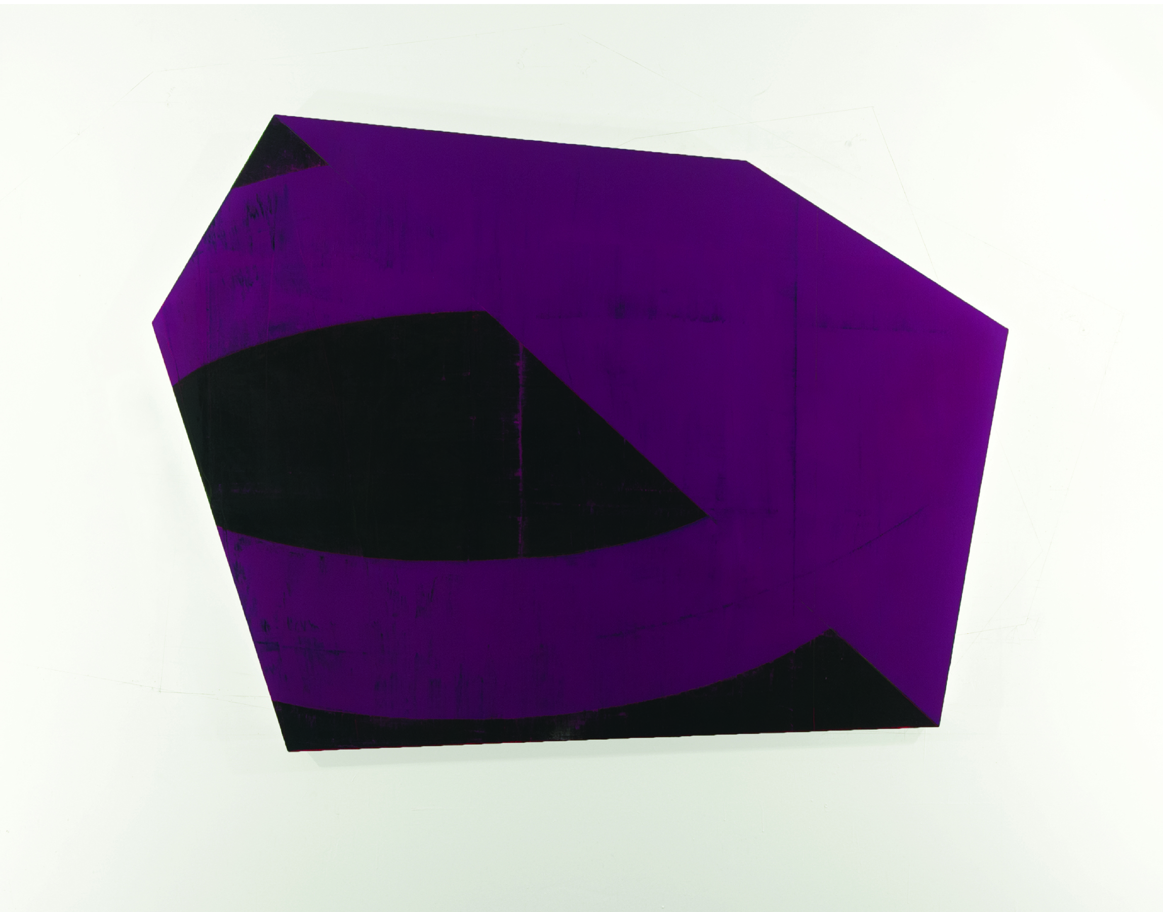
David Row, “Rubidium,” 2013, oil on canvas. (Photo courtesy of the artist)
The same happens with “Giza” and, especially, “Way Out West.” This hovering and shifting, along with the mottling of color so that each value adds chromatic variety and dimension, seems an apt metaphor for the nature of realty, which is constantly, like the visual effects of these panel paintings, morphing into the next thing… and then the next.
STEVE BARTLETT
By contrast, Bartlett’s sculptures in “Passing By” mostly feel perfectly still. The largest ones can resemble boulders, stolid and silent, or guardians of some kind. Their surfaces are sensual and smooth yet slightly faceted rather than perfectly rounded. They are also mostly natural wood, though occasionally, as in “Edison,” painted in parts or, (i.e.: “Untitled 76” and “Untitled 79,” which are stained in ombré shades).

Steve Bartlett, “Edison,” 2025, ash, stain, epoxy, paint, wax. (Photo courtesy of the artist)
These curvaceous forms and their natural material presence spar back and forth with Row’s paintings — motionless versus constantly shifting, organic woods versus brightly painted colors. Within them are naturally occurring patterns of grain, but also other patterns created by changes in the direction of the slats Bartlett is gluing and sanding together, such as in “Hover” and “Passing By,” the title work, which clearly demarcates three levels of pattern divided where one section meets the next. Despite this variability, the figures maintain, almost reassuringly, their congruity and stillness.
The exceptions are works such as “Casa Grande 3” and “Casa Grande 5,” which allude to figures articulated as if in motion. These recall the work of Archipenko in some ways, especially because both artists begin with the figure and then deconstruct and reassemble them so that their various components feel teetering or striking a pose.

Steve Bartlett, “Casa Grande 5,” 2023, ash, stain, epoxy, wax. (Photo courtesy of the artist)
ELLEN WEITKAMP
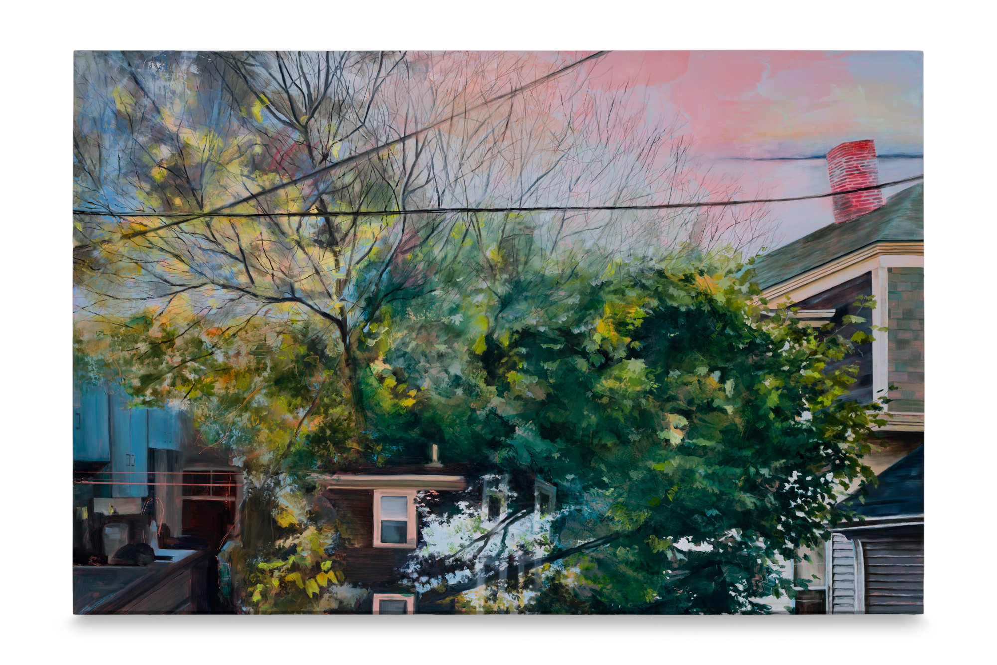
Imagine what would happen if you tracked the thoughts, images and sensations you encountered throughout your day and then jumbled them together. You might perceive the kitchen around you as you prepare tea, then notice as you walk into the next room the magnificence of the tree outside the window. A few hours on, you’ll note the reflection of blue sky and another tree on your window partially washed out by the sun’s glare on the glass pane. Still later you’ll detect that the light has changed and the sky has turned a cotton candy pink that colors the white window frames on the house across the street.
Advertisement
Ellen Weitkamp, “Summer to Spring,” 2026, oil paint and colored pencil on panel. (Photo by Hannah Stoll)
If all these came crashing together in a single image, they would look like “Summer to Spring,” one of several extraordinary mind-bending paintings in “Borrowed Light,” Ellen Weitkamp’s first solo show in Maine. This is a painter of memory and passing time who captures the sense of the day’s (or months’) events but swirls them together in enigmatic compositions that don’t make sense at a superficially factual level yet illustrate the mystical concept of no separation.
This principle, whether depicting it is what Weitkamp is up to or not, holds that everything is here all at once in every moment — past, present and future — and that the only thing that separates individual objects and moments at any particular instant is what our minds choose to focus on through the limited perceptual capacities of the brain. In actuality, what happened years ago in Weitkamp’s Munjoy Hill apartment, what she observes transpiring in it right now and what may happen centuries hence when she is long gone all coexist in this moment.
“Our Apartment Windows (Window 5, Summer)” points up the instability of what we perceive in any given moment by portraying a window reflection of Weitkamp and her partner at a table. Weitkamp’s head and the pendant lamp above her are double images, as if one moment’s view of them is dissolving as the next version appears a millisecond later. We also see the reflections of the room around them and the window that must be across from this one. But these are all surmised realities, deductions based on what we think we are observing. The fact that we’re trying to figure out what we’re looking at in itself speaks to how expertly Weitkamp scrambles what we take for granted to be the accuracy of our perception and our belief and/or desire to think we know what we see.
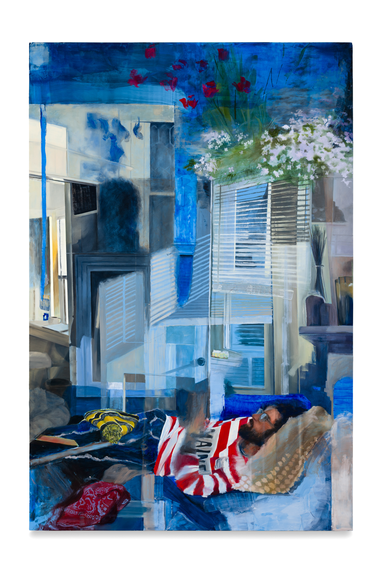
Ellen Weitkamp, “Between January and May,” 2026, oil paint and colored pencil on panel. (Photo by Hannah Stoll)
The title of “Between January and May” hints at the span of time represented in another canvas. It is a cacophony of angles, perspectives, shadows and memories intersecting each other across the picture plane. There is possibly more than one room represented, and the flowering window box at top right is clearly a memory from the outside that has incongruously entered the room(s) “mind.” They are obviously collaged recollections, but there is no definition between one element and the next. Instead, they seem to blur and unfold one into the other, more like looking through multiple stacked photo transparencies.
This is virtuosic painting, but also immensely exciting. Weitkamp is a painter to watch.
JOHN WHALLEY
Finally, Greenhut’s solo show occupies the gallery where Bruce Brown formerly curated his photography shows. It’s easy to confuse it as a Cove Street show because it is physically more a part of the latter than the former (now its own separate room on the parking lot side of the building).
Advertisement
John Whalley is a preternaturally skilled realist painter. His powers of observation are astonishing, a fact so obvious that the case containing the actual objects that appear in the paintings seems superfluous. It’s clear from the paintings what he can do, so why include the objects?
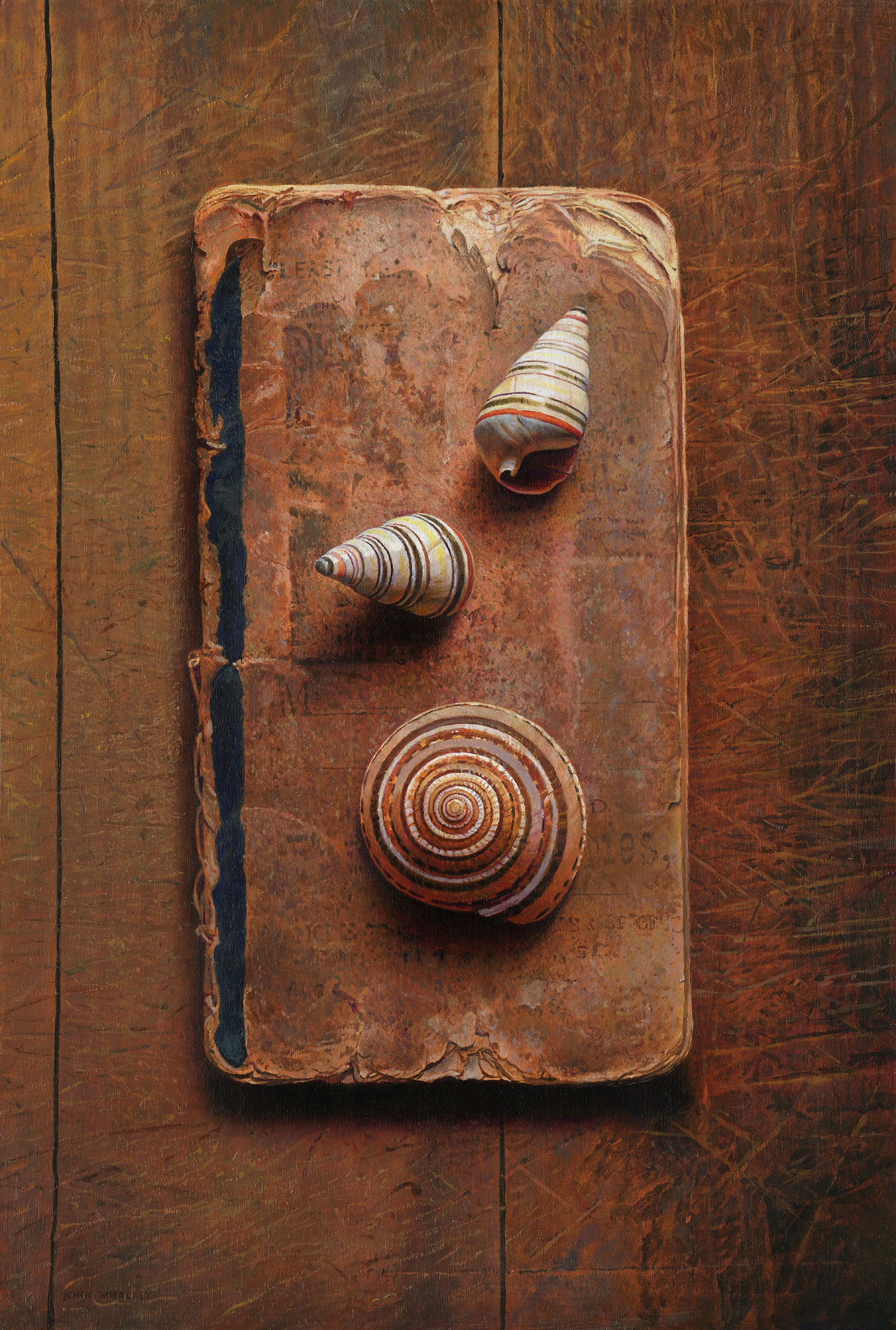
John Whalley, “Spirals,” oil on panel. (Image courtesy of the artist)
As it happens, though, what the objects make clear is that Whalley is intensifying colors of many of his subjects, and I’m uncertain about the necessity of doing this. His layered compositions are lyrical and unabashedly beautiful, if occasionally a bit sentimental and nostalgic. But in painting a work like “Spirals”— which depicts colorful shells resting on a tattered antique pamphlet, itself on top of a wood board — feels dreamy and romantic. The detail of the wear and tear on the publication is almost beyond belief.
Yet if we look at the actual pamphlet, its countenance is much drabber and faded. That made me wonder why Whalley chose to darken it. Wouldn’t it be more evocative of time and the past if the color value were more accurate? Was the depth of color the result of the way a shadow hit the book in his studio? Is intensifying the color a way to bring the object back to life in some way? And if so, what would be the point of that?
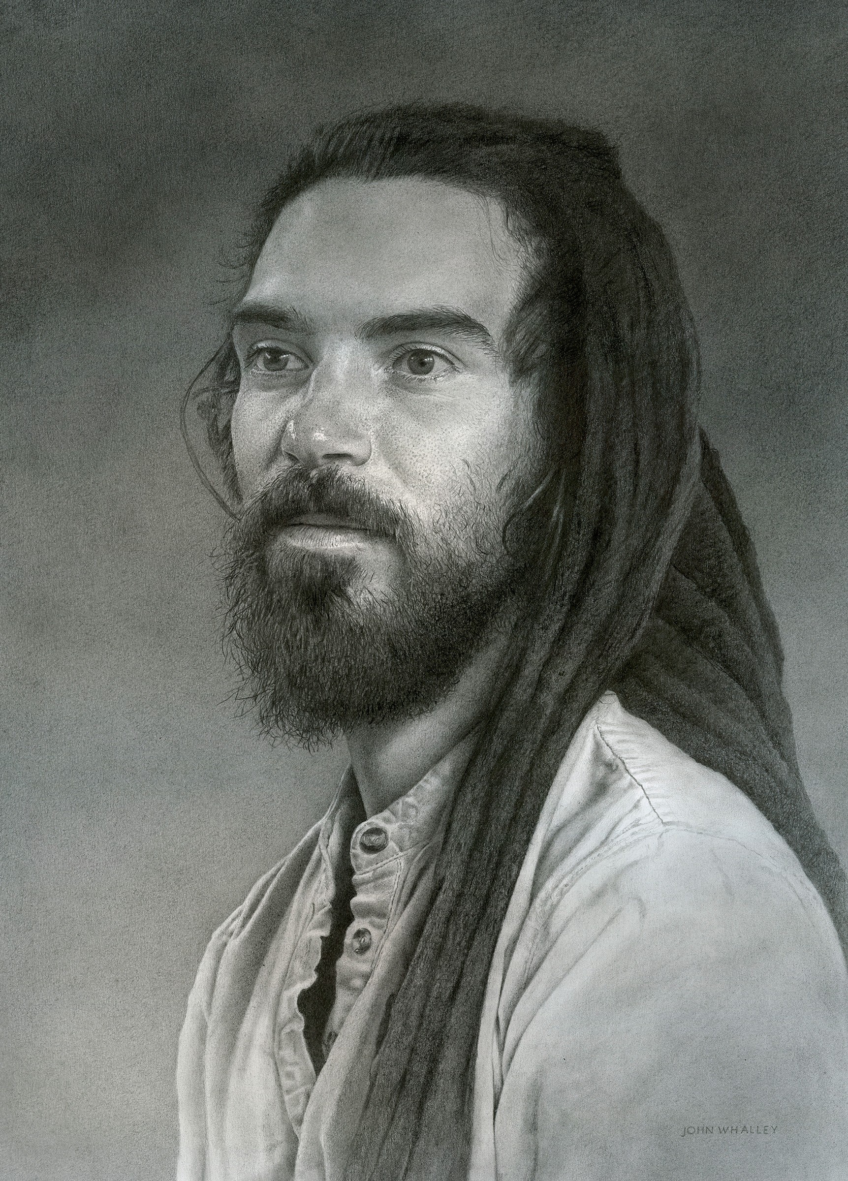
John Whalley, “Nate,” graphite on paper. (Image courtesy of the artist)
The same with “Claw,” where the book’s red is more vivid than its reality and the lobster claw atop more lavender. Which is why I find Whalley’s graphite drawings even more extraordinary. “Nate,” “Tool Shed,” “Timeworks” and “Pemaquid Wave” are just as skillful, if not more so, because Whalley is conveying his realism within a far more rigorously restricted palette — basically grisaille — and exquisitely transmitting the play of light and shadow in spite of this limitation. It is also a medium that curtails the impulse toward sentimentality.
It’s all gorgeous, to be sure, and incontestably masterful. In the end, however, the actual objects are not necessary to prove any of that. I’m already wowed.
IF YOU GO
“From the Frozen Soil,” Notch8, 52 Center St., notch8art.com. Through Sept. 5.
“Reflections” (through Sept. 5), “Passing By” and “Borrowed Light” (both through Sept. 16), and in the Greenhut space, “John Whalley: Things As They Are” (through Sept. 26), Cove Street Arts, 71 Cove St., covestreetarts.com and greenhutgalleries.com.
Copy the Story Link
Tagged: art, art gallery, art review